


Content Page Template (Font: Crimson Text)
This page is a living style-guide reference for content-page design elements, colors, typography, headings, and common components, all tied to the corsetmaking.css token system (:root variables). Use it when building new content pages to match existing colors, fonts, and sizing instead of guessing or hardcoding new values. p class="content-page-paragraph"
Reference last updated: 2026-09-25. Update this page whenever new tokens or content-page components are added to corsetmaking.css. class="content-page-text-fine-print"
H1: Page Title (rendered by the page shell, not editable here)
Font: var(--font-accent) (Crimson Text), Size: var(--font-size-35), Weight: 600, Color: var(--text-body). This comes from the h1.page-title-header rule and appears above the Header zone on every page using this template.
Class: h1 class="page-title-header"
Colors
Brand
--brand-gold-accent (#d7b364)
--brand-gold-text (#8a6d3b)
--brand-charcoal (#474b59)
--brand-purple (#850d70)
--brand-magenta (#9b2a76)
Secondary Gold
--gold-cta-button (#eeb859)
--gold-border-muted (#c19548)
Neutrals / Text
--text-body (#3e3e3d)
--text-muted (#4e4e4e)
--text-fine-print (#474747)
--border-light (#d1d3d4)
Secondary Grays
--gray-btn-dark (#484848)
--gray-nav-active (#444444)
--gray-footer-contact (#373737)
--gray-form-label (#363636)
--gray-footer-newsletter (#605f5e)
--gray-tree-link (#5f5f5f)
Hover States
--hover-gold-light (#fed375)
--hover-magenta (#ca2daf)
--hover-gray-password (#8c8c8c)
--hover-gray-search (#adadad)
--hover-gray-logout (#d0d0d0)
--hover-gray-checkout (#e3e3e3)
Department Colors
Corset, Bra, Hat, Steampunk, Leather, and Costume each have their own accent colors, used for department-tinted backgrounds and text (About page department blocks, homepage category background). These are not part of the :root token system above - they're hardcoded per department in corsetmaking.css and could be tokenized later if the need arises. Full details and usage notes are tracked separately.
See: claude/cms-department-colors-reference-2026-09-25.md (Project Files)
Corset - Color 1 (rgb(133, 82, 125))
Corset - Color 2 (rgb(157, 99, 153))
Bra - Color 1 (rgb(197, 77, 112))
Bra - Color 2 (rgb(230, 65, 116))
Hat - Color 1 (rgb(0, 154, 190))
Hat - Color 2 (rgb(0, 190, 233))
Steampunk - Color 1 (rgb(119, 16, 0))
Steampunk - Color 2 (rgb(133, 30, 0))
Leather - Color 1 (rgb(35, 31, 32))
Leather - Color 2 (rgb(14, 14, 14))
Costume - Color 1 (rgb(223, 127, 32))
Costume - Color 2 (rgb(255, 135, 0))
Accessibility: Old vs. New Gold
The original decorative gold (#d7b364) does not meet WCAG contrast requirements when used as a text color on white. --brand-gold-text (#8a6d3b) is the accessible replacement used for gold text sitewide since the 2026-08-23 accessibility pass. --brand-gold-accent remains correct for buttons, borders, and backgrounds, where contrast is handled by pairing it with white or black text rather than using it as the text color itself.
OLD - #d7b364 used directly as text color (fails WCAG AA on white)
Sample Gold Text
Smaller sample gold text for links or labels
NEW - var(--brand-gold-text) as text color (accessible)
Sample Gold Text
Smaller sample gold text for links or labels
--brand-gold-accent (#d7b364) - buttons, borders, backgrounds only
--brand-gold-text (#8a6d3b) - text use
Font Families
--font-primary: Montserrat, sans-serif
--font-secondary: Open Sans, sans-serif
--font-accent: Crimson Text, serif
Usage: style="font-family:var(--font-primary)" (or --font-secondary / --font-accent)
Found in the Wild (not part of the palette)
Helvetica Neue appears in exactly one place site-wide: the Edit Options modal dropdown (.c-dialog select.c-form-select__dropdown) in the basket edit-item flow. It matches the browser/Bootstrap default font stack rather than a deliberate brand choice. Not recommended for new content, use var(--font-primary), var(--font-secondary), or var(--font-accent) instead.
Font Size Scale
--font-size-10 (10px) - The quick brown fox jumps over the lazy dog
--font-size-11 (11px) - The quick brown fox jumps over the lazy dog
--font-size-12 (12px) - The quick brown fox jumps over the lazy dog
--font-size-13 (13px) - The quick brown fox jumps over the lazy dog
--font-size-14 (14px) - The quick brown fox jumps over the lazy dog
--font-size-16 (16px) - The quick brown fox jumps over the lazy dog
--font-size-17 (17px) - The quick brown fox jumps over the lazy dog
--font-size-18 (18px) - The quick brown fox jumps over the lazy dog
--font-size-20 (20px) - The quick brown fox jumps over the lazy dog
--font-size-25 (25px) - The quick brown fox jumps
--font-size-30 (30px) - The quick brown fox
--font-size-35 (35px) - The quick brown
--font-size-50 (50px) - The quick
--font-size-60 (60px) - Quick fox
Usage: style="font-size:var(--font-size-14)" (swap in any step above)
Headers (H2-H6)
This is an H2
Class: h2 class="content-page-header"
This is an H3
Class: h3 class="content-page-subheader"
This is an H4
Class: h4 class="content-page-header-4"
This is an H5
Class: h5 class="content-page-header-5"
This is an H6
Class: h6 class="content-page-header-6"
Paragraph / Body Text
This is standard content-page-paragraph text. Font: var(--font-primary), Size: var(--font-size-14), Color: var(--brand-charcoal). Here is a paragraph with a link to a category page, showing the default link and hover-gold treatment.
Class: p class="content-page-paragraph"
This is content-page-quote-paragraph, an italic inline variant used for pull-quotes within body copy.
Class: p class="content-page-quote-paragraph"
Link Styles
Several link treatments exist around the site. Use one of these named versions going forward instead of an unstyled link (which falls back to Bootstrap's default blue, #337ab7, since no site-wide base link color is set) - that default-blue look is what shows up in some older custom field content, including the two "Other Reusable Patterns" examples below.
Gold link, no underline, stays gold on hover
Class: a class="content-page-link-gold" (matches the site's telephone-link / email-link pattern)
Default-color link, turns gold on hover, never underlined
Class: a class="content-page-link-gold-hover" (matches the standard in-paragraph link shown above)
Gold, underlined link, fades to muted gray on hover
Class: a class="content-page-link-underline" (matches the "Read More" link pattern)
Unstyled link (Bootstrap default blue) - legacy look, avoid for new content
No class - this is what you get by default, seen in older custom field content
Blockquote
Corsetmaking is equal parts engineering and artistry. Every pattern piece has a purpose. Example attribution line
Class: blockquote class="content-page-blockquote" (with an optional cite tag inside for attribution)
Code / Pre
Inline code example: --font-size-14 renders using the content-page-code class.
Class: code class="content-page-code"
h2.content-page-header {
font-size: var(--font-size-18);
color: var(--text-body);
font-family: var(--font-primary);
}
Class: pre class="content-page-pre"
Lists
Unordered List
- Bones and boning channels
- Busks and closures
- Grommets and lacing
Class: ul class="content-page-ul"
Ordered List
- Cut fabric pieces from pattern
- Sew panels together
- Insert boning channels
Class: ol class="content-page-ol"
Table Styling
| Code | Name | Price |
|---|---|---|
| DB-PS010 | Psylo Slub Tee | $64.00 |
| DB-PS101 | Psylo Reslub Sweater | $51.00 |
Class: table class="table table-striped table-hover" (native Bootstrap classes)
Image Treatments
Banner Image (full-width)

Class: div class="content-page-banner-image"
Inline / Product Image (centered, capped width)

Class: div class="content-page-image-container"
Other Reusable Patterns (Found Elsewhere on the Site)
Tutorial Link + Responsive Image (Product Custom Field)
Used in the "Tips & Tutorials" product custom field, rendered as a collapsible accordion panel on PROD pages (alongside Overview, Technical Specs, and Reviews). Pattern: a plain text link, followed by a separately link-wrapped image using img-responsive (Bootstrap's native responsive-image class).
Learn How to Set a Busk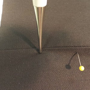
Markup: a href="..." (link text), then a href="..." img class="img-responsive" (image)
Technical Specs Variant (Opens Full-Scale in New Tab)
A variant of the same pattern, used in a Technical Specs custom field, where the link text itself is the caption and target="_blank" opens the full-size chart image in a new tab.
Click the chart to see it in full-scale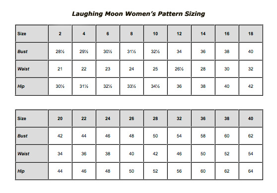
Markup: a href="..." target="_blank" (caption link), then a href="..." target="_blank" img class="img-responsive" (image)
Product Page Accordion Sections
The Overview, Technical Specs, Tips & Tutorials, and Reviews sections on PROD pages use div.product-page-section-toggle for the collapsible toggle row.
Class: div class="product-page-section-toggle"
Sizing Table - Legacy vs. Recommended
Older product custom fields (e.g. the 1864 Spanish Jackets sizing table) hand-code tables with inline colors that predate the token system - #790000 and #fbf2f0 below aren't in the current palette. Don't copy the colors from this one; it's shown for reference only and will phase out as those products are discontinued or updated. The recommended version below uses the same Bootstrap table classes already shown in Table Styling above, wrapped in Bootstrap's native table-responsive class instead of a hand-rolled overflow-x:auto div.
Legacy version (as found, do not reuse colors):
| Sizing | A | B | C |
| Bust | 30" | 32" | 34" |
Recommended modern version (copy this for new sizing tables):
| Sizing | A | B | C |
|---|---|---|---|
| Bust | 30" | 32" | 34" |
Markup: div class="table-responsive" wrapping table class="table table-striped table-hover" (identical to the Table Styling example above, just wrapped for horizontal scroll on wide tables)
Buttons
Primary Button Secondary ButtonClass: a class="content-page-button-primary" / a class="content-page-button-secondary"
Form Elements
Classes: label class="content-page-form-label" (labels) + input/select class="form-control" (native Bootstrap for fields, checkboxes, and radios)
Muted / Fine-Print Text
This is content-page-text-muted (var(--text-muted), 12px, Open Sans). Used for secondary/supporting copy.
Class: p class="content-page-text-muted"
This is content-page-text-fine-print (var(--text-fine-print), 11px, Open Sans). Used for disclaimers and small print.
Class: p class="content-page-text-fine-print"
Notice / Callout Boxes
Class: div class="content-page-notice"
Class: div class="content-page-notice notice-success"
Class: div class="content-page-notice notice-error"
This is the Footer content area (renders below the main Content section, via hdft param="footer"). Anything placed here appears at the bottom of every page that shares this template's footer zone. p class="content-page-text-muted"


